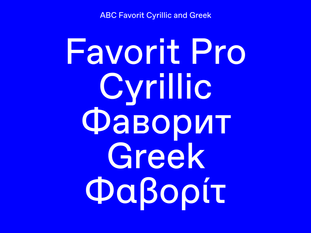
Typeface Release: ABC Favorit Cyrillic & Greek

We were initially inspired to draft a Cyrillic version of ABC Favorit after seeing the trilingual designs of Tallinn Kunstihoone’s identity—a fluid combination of Estonian, Russian, and English languages. As soon as we got home from our brief trip to the Estonian capital, we eagerly began our Cyrillic extension process, despite not having any personal knowledge of the subject matter whatsoever...
In 2016, we continued the exercise by extending our ABC Favorit Cyrillic to a Bold style—wrestling with the architecture of seemingly familiar letterforms (like Я) as well as especially dense characters (like Ж). It was at this moment in time that we began doubting our ultimately very Latin-centric perspective, and so we consulted with Maria Doreuli and Liza Rasskazova of the Moscow-based Contrast Foundry, to get their much-needed input.
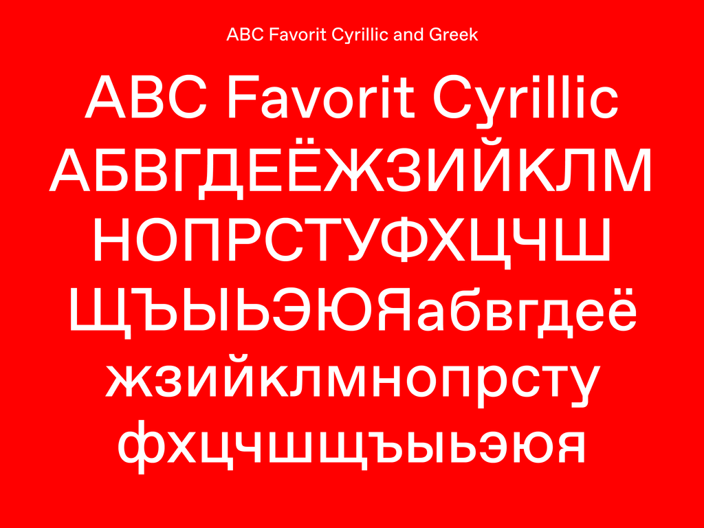
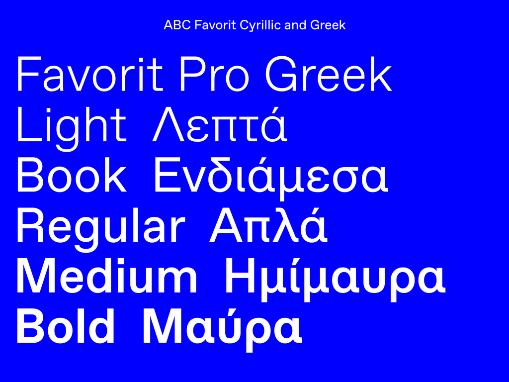
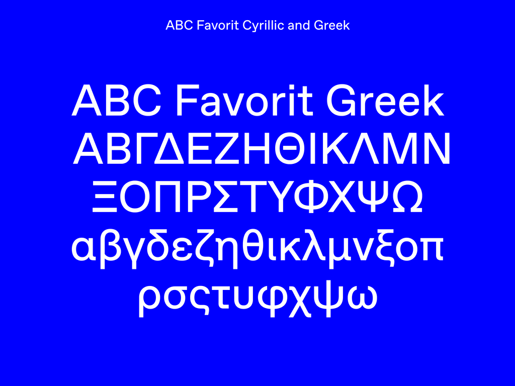
Having learnt a lot from this particular experience, in 2018, we commissioned font designer Panagiotis Haratzopoulos to create a Greek version of all ABC Favorit styles. Both Cyrlilic and Greek versions of ABC Favorit are available with ABC Favorit Pro. In 2019, the typeface continued on its travels when we partnered with Mingoo Yoon to design ABC Favorit Hangul.
Below, Maria Doreuli and Liza Rasskazova explain the design process behind creating their Cyrillic counterpart. Then, Panagiotis Haratzopoulos describes how he approached his Greek extension.
Maria Doreuli and Liza Rasskazova on ABC Favorit Cyrillic
“Dinamo’s website describes ABC Favorit as ‘a straightforward low-contrast grotesque that combines a rigid drawing with subtle oddities and a humorous touch.’ ABC Favorit ultimately straddles the line between an experimental and traditional typeface. This notion encouraged us to draw a Cyrillic version of the typeface that avoided the conventional solutions one might usually resort to for a language extension.
“Few Cyrillic characters are conducive for sans-serif experimentation. There’s not many characters that can include the original design features of the Latin versions. And so often, Latin script typefaces are neutral and traditional in their Cyrillic counterparts. They’re usually too safe, or on the other extreme, far too wild and inaccurate to the script. Characters that break with Latin forms often stand out too much in extensions. д, л, б, к, ж, я,are the primary characters in a sans-serif where one can do something different. Our goal was to keep the same level of playfulness in a Cyrillic version of ABC Favorit as in the Latin one. Therefore, each of the aforementioned letters required a specific approach, as well as experimentation and a little bit of humor.
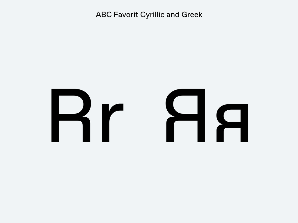
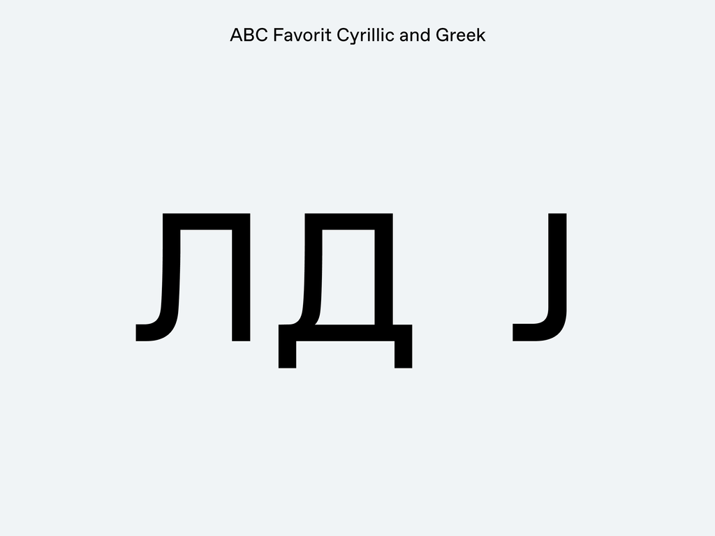
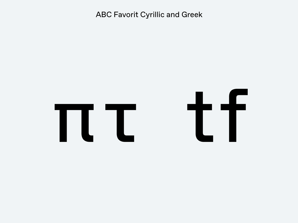
"ABC Favorit’s latin R, with its vertical leg, led to a similar design for the Cyrillic Я. Yet that was not enough. R is just one of the shapes that shows ABC Favorit is far from humanistic. All elements in Latin that are commonly smooth are straight and brutal in ABC Favorit. So we followed the same approach when constructing the Cyrllic Л and Д. "It wouldn’t be fair to use the traditional convention, which is to make the left vertical Л smoothly diagonal, as in humanist designs when even the leg of the R is strictly vertical. This resulted in an almost vertical left swoop, and a small radius of rounding in the Л and Д characters. They fit well alongside not only the legs of R and Я, but with the details of the Q and J in uppercase, and j, t, and f in the lowercase.
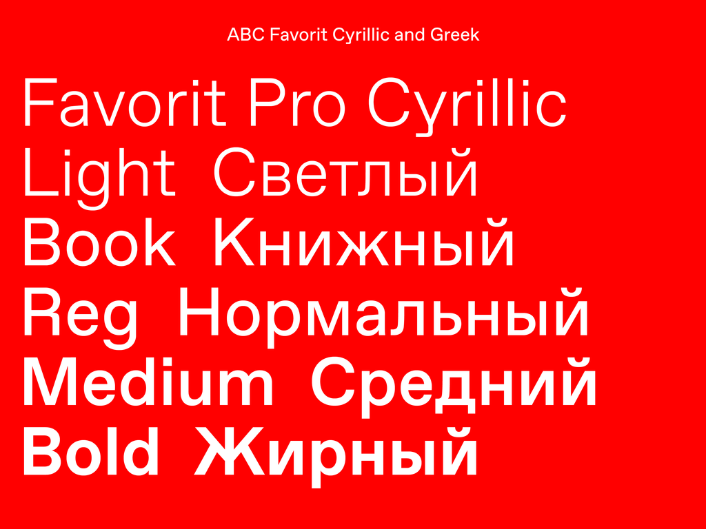
“As we started work on the Cyrllic extension, we first examined the entire ABC Favorit family and the system determining it. What range of weights does it have? How bold is the Bold? How do the italics appear, and how slanted are they? This helped us to grasp what solutions will work best in each particular case. We realized that ABC Favorit gave us more room for experimentation than usual, because the weights are not too extreme.
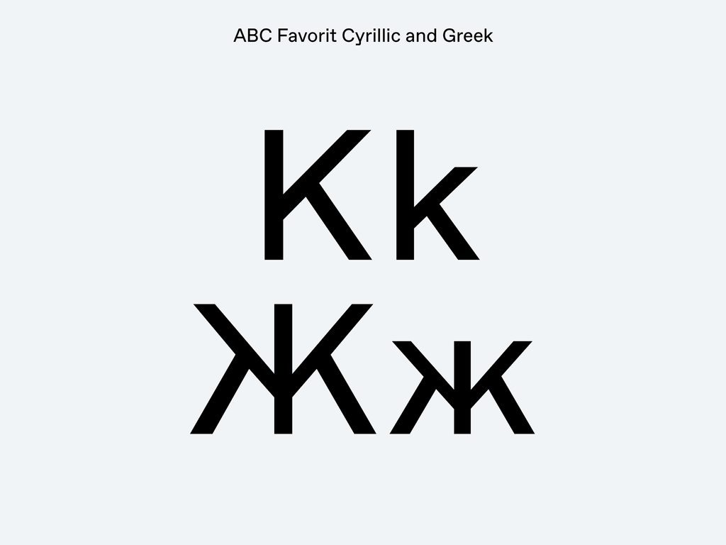
“In regards to this, we had been thinking about the construction of the character Ж for a long time. Commonly in extensions, the Cyrllic К and Ж are different from the Latin K. That’s because the middle section of the Latin K often becomes complex if flipped to make a Ж. So К Ж are often simplified in the middle to avoid the Ж problem. ABC Favorit has a distinctive K though, and we did not want to loose it. It was because of the small difference between the weight of the Light and Bold styles that ultimately allowed us to use the Latin-based design for K. We thought: Why simplify the construction of the Ж in this sans-serif typeface, when you can keep a distinctive construction? The resulting intersection in the Ж in ABC Favorit does not get spotty, and its counter shapes are not too busy.
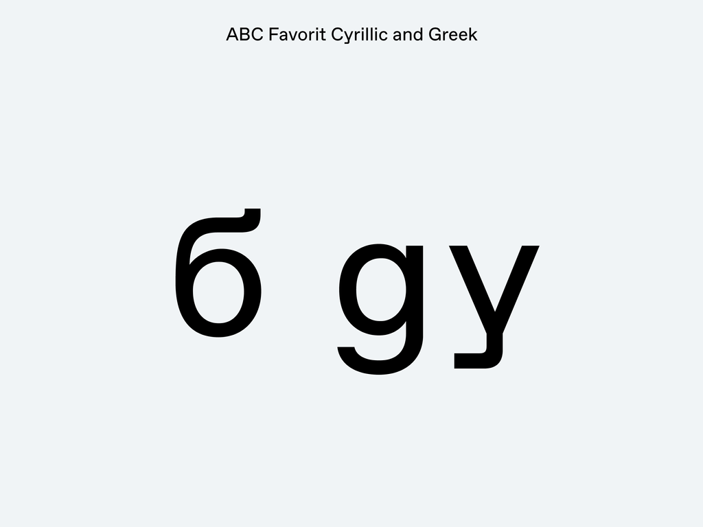
“Last but not least, we could not forget the б character. б, more than any other letters within the Cyrllic alphabet, has a lot of room for experimentation. The б in ABC Favorit echoes the y, but at the same time has a more traditional sensibility.”
Panagiotis Haratzopoulos on ABC Favorit Greek
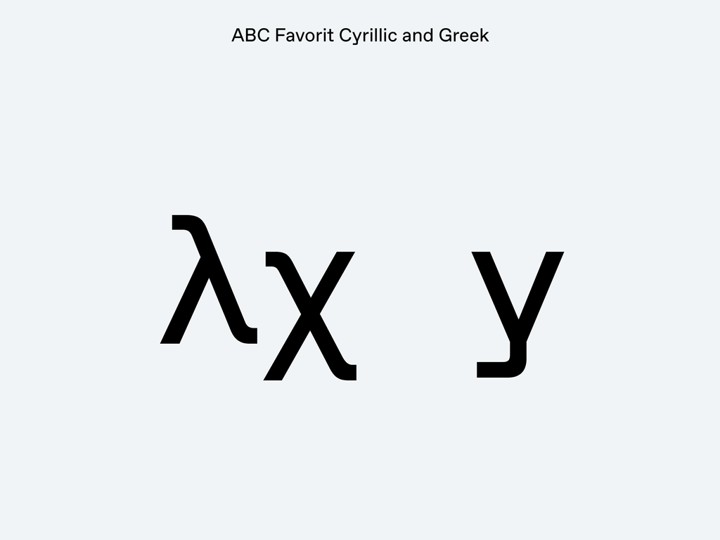
“Greek ABC Favorit respects the natural style of its Latin counterpart, and all the small oddities that characterize it. To achieve this style, it draws inspiration from Greek grotesques from the ’60s and ’70s, rather than later examples (especially those created after 2000), which are more subjective and quite busy. The special touches of its Latin version are present in the Greek to some extent—such as the terminals of lambda, tau, and chi (λ, τ, χ).
“At the same time, I sought to balance the use of spurs and terminals, in order to retain the tight quality of the typeface, while also preserving the typical curvy style of Greek letterforms."
Credits
Design: Dinamo (Johannes Breyer & Fabian Harb, with Erkin Karamemet, Immo Schneider, Robert Janes), Daniel Chessari, Maria Doreuli, Liza Rasskazova, and Panagiotis Haratzopoulos
Spacing and Kerning: Igino Marini
Font engineering: Chi-Long Trieu